Over the last few months, half a dozen of my writing coach clients have finished their books. After celebrating that accomplishment, we jumped into book cover design consults, reviewed samples of both the cover and the interior pages, asked for tweaks on both and then made selections, reviewed the digital cover and interior pages proof, reviewed any changes we asked for, and finally ordered a physical book proof.
That’s when things get real. Instead of looking at your book on a computer, you actually receive a book you can hold. It can be a moving experience.
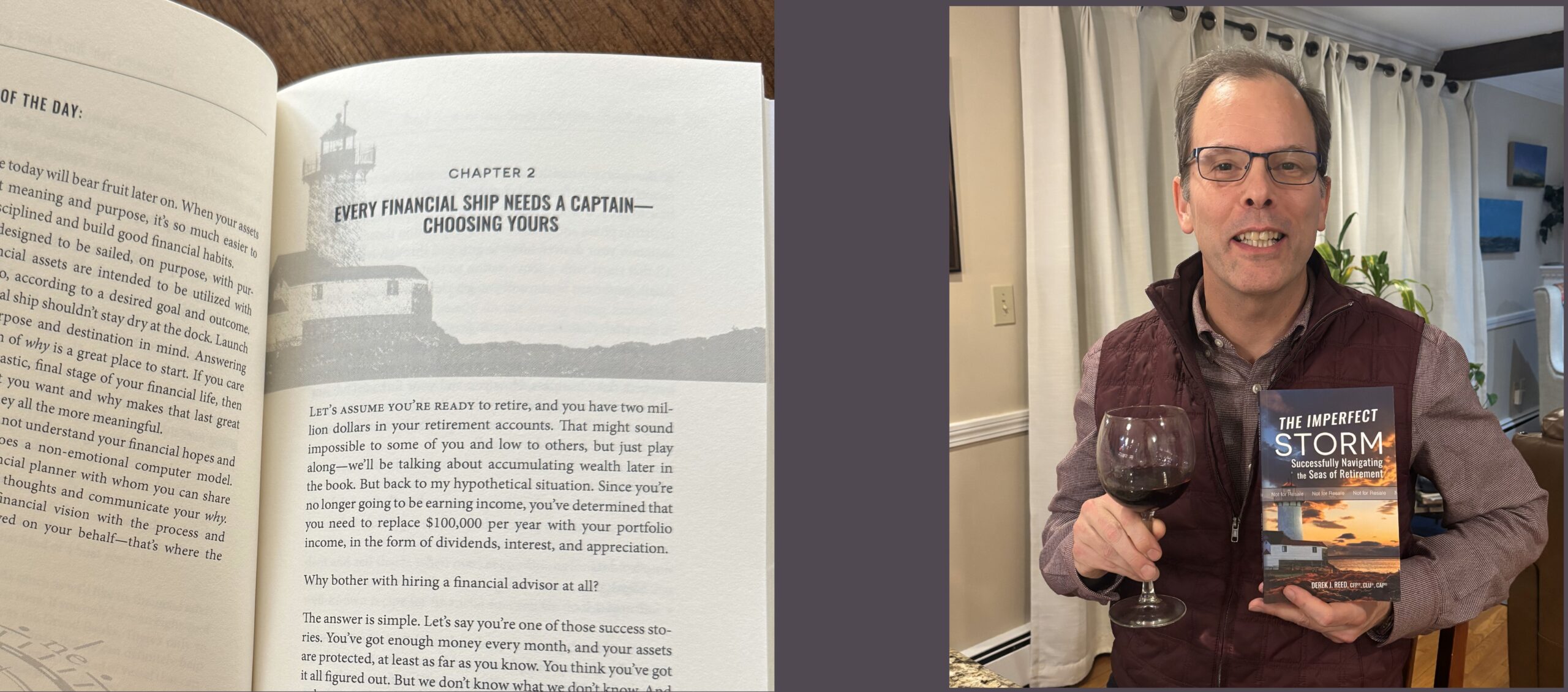
“I’ll probably shed a tear,” said my writing coach client, Derek Reed, author of The Imperfect Storm: Successfully Navigating the Seas of Retirement, which will be published next month.
When his book proof did arrive, he found it “very humbling and a little surreal,” sentiments clearly etched on his face. Just check out the photo above.
Of course, it helps to know what to look for once you get over the emotional high of holding that book proof. This is your opportunity to make sure everything is right before you greenlight its publication, a critical step since mistakes can sneak in during every step of the publishing process.
Start with checking out your cover.
How does it look? Are the colors, title, subtitle, and byline sharp and popping? Does everything look straight and centered if it’s supposed to be? Do you like the matte or glossy finish you selected, or would the other option perhaps work better?
Double-check all the text on your front cover, back cover, and spine, along with the ISBN, barcode, and price, to make sure they’re correct. One of my clients didn’t notice that the title on his spine had been misspelled. In the next edition, the barcode on the back cover hadn’t been updated. So, you really need to verify all these details. While you’re at it, make sure the ISBN matches what you have on your copyright page.
Now, you’re going to move to the book’s interior.
For starters, yes, you’re going to want to re-read your book yet again to make sure no mistakes have been introduced. Stay on the lookout for text blocks that have gone missing or are wonky, as well as any typos and grammatical mistakes. I know you’ve conducted this error hunt before, but you’ll see it differently in print.
Once you’ve ascertained that the content is okay (or made note of any problems), it’s time to scrutinize the mechanical elements.
Are all the pages and chapters–including all the front and back matter like your title page, copyright page, dedication, table of contents, acknowledgments, and author bio complete, correct, and in the right order?
Do the chapter headings and page numbers in the table of contents match the actual chapter titles and page numbers in the book? If you’ve pointed the reader to a specific chapter or page number, make sure those are still correct.
Are there any font, layout, or word and line spacing inconsistencies in the running text, chapter headings, or subheads?
Are all the footnotes and URLs right? Make sure.
Check the paragraph indentations. Most design styles call for no indentation at the beginning of a chapter or a new section.
Do you have any orphans or widows–those single lines at the bottom of a page or a tiny fraction of the last line of a paragraph at the top of a page? What about runts–a single word on a paragraph’s last line? Those don’t look so great, so note those so the designer can fix them. I’m also a fiend when it comes to word breaks where the second part of a word on a new line is less than four letters. After my years spent editing magazine articles, that’s a hard no for me.
Once you have a list of corrections…
Ask your designer(s) to make the appropriate changes. Then double-check those, at least on a digital proof. If the quality of your cover was problematic, definitely order a new print proof before you publish. You deserve a book that reflects the time, effort, and passion you’ve put into it.


0 Comments