


Your book is almost ready to launch. The hardcopy book proof you just received from Amazon or IngramSpark looks great. The interior page layout you saw as a short sample and in the electronic proof looks even better now that you’re holding the actual book. Then you check the ebook proof on your Kindle reader and notice that the interior page design doesn’t exactly look the same. Maybe the spacing in between words is off. The fonts may even be different. What’s going on? you wonder. Did the interior designer make a monster mistake?
In a word, no. You’re witnessing firsthand the difference between publishing a book that people can hold versus an electronic version of your book that will be played on a variety of mobile devices, each with its own set of capabilities. Every device displays ebooks differently—even if the same company makes them.
That can be downright perplexing when it comes to the book you’re about to birth.
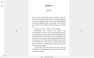
When my writing coach client Jeff Hutcheson looked at the electronic proof of his novel Going Barefoot, which launches next week, he noticed odd spacing that wasn’t present in the print version. The explanation:
Sometimes, the justified formatting results in what looks to be extra spacing. The ebooks are reflowable, which means spacing will reflow depending on the text size you have set. As long as we aren’t awkwardly jumping from one page to another with a giant space, it’s all pretty normal. When you go looking for errors, you will see the extra spacing, but the good news is that the average reader rarely – if ever – notices.
He also observed that the font on the chapter headings showed up as the heavy, blocky font he had steered away from during the design process. However, on a different Kindle reader, the font on the chapter headings and the signature was the one used in the print book. The explanation:
The all-mighty Google says there was a system update that allowed specialty fonts in Summer 2018, and devices purchased before this (or more likely before 2019 since the devices sit in a warehouse for months being going home with owners) may not have this update.

For more information about how all this works, check out Toni Ressaire’s Medium.com blog post Why Your eBooks Don’t Look Like Print Books.
In the meantime, you likely can install specialty fonts on your older Kindle once you update the firmware. For instructions on how to do both, check out How to Install Custom Fonts on your Kindle Reader.
Sorry, comments are closed for this post.