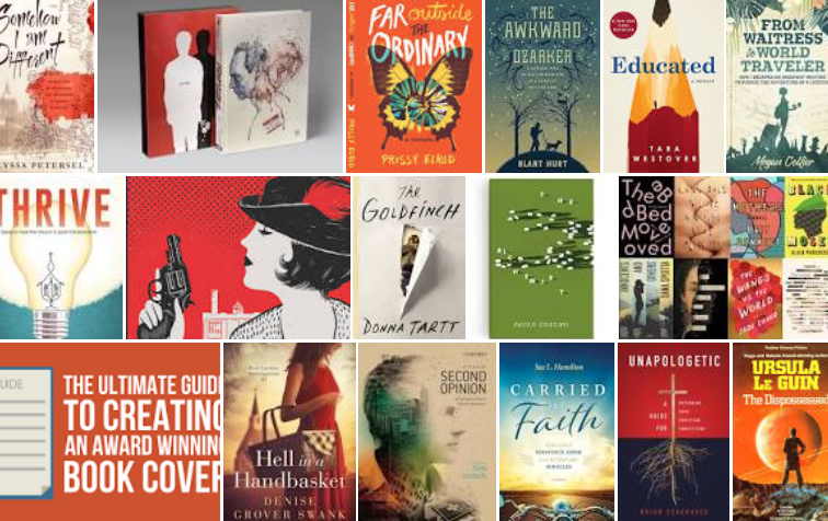
You’ve thrown everything you have into your book, and it’s finally done. Now it’s time to design a cover that not only does it justice, but grabs the notice of potential readers. But here’s the deal. Most of them won’t be seeing it in real life. Instead of seeing a book that measures, let’s say, 6″ x 9″, they’re going to see a thumbnail of that cover online. At best, that cover is going to be the size of, well, a thumbnail.
So you have to keep your book cover simple if you want it to be eye-catching. You also want it to capture the feeling and message of your book. And it needs to dovetail with the book’s genre, but not blend in with all the other books. (Are you starting to understand why a professional book designer might be worth the investment?)
If you’re not just going with a typographical treatment, opt for a single central image. Using a stock photo is an option and can save you money since there are sites like Unsplash and Pexels that offer royalty-free photos. Just check that the image hasn’t been used all over the place since you want an original-looking cover rather than one that looks like a cliché. Also, be sure to double check that you have the legal right to use the image you choose. If using free stock images, review the copyright information and make sure you secure the correct license(s).
You’re also going to want to find an image with a high enough resolution so it doesn’t look blurry. For print, look for a minimum resolution of 300 dpi. For an e-book you want a minimum of 72 dpi.
Photo considerations are, of course, just the start. You’ll also need to make sure all the front and back cover elements have been incorporated. Front cover elements include the title, subtitle (for non-fiction) and byline. Back cover elements include the author bio, the book summary, endorsements or reviews, and the barcode. And don’t forget about the spine, which features the title and byline.
Does all of this sound a bit overwhelming? Let’s take a step back—back to your library or bookstore. Take yourself on a cover hunt. Just pick out the ones that grab you. Maybe it’s the color. Maybe it’s the type. Maybe it’s the photo. Grab enough of them and you’ll start seeing a pattern. And that will help, whether you’re working with a book designer or not.
The last consideration, at least the last one we’ll discuss right now, has to do with who you are and why you’re writing the book. If you want your book to market your business, you might want your cover to dovetail in some way with your professional brand. If you don’t have a professional or author brand, you might want to consider one. But that’s a post for another day.
In the meantime, if you want to learn more about cover design, check out my sister company Incubation Press. You’ll see some great examples of the covers we’ve recently designed and the books we’ve helped people to self-publish. Then reach out if we can help.


0 Comments